
Creating a loop smooth image carousel slider in Elementor page builder is very much easy, if you follow this tutorial step by step.
1st Step: Create images/logos of equal height and size.
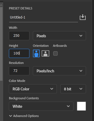
The images you want to setup as a carousel must be created in a equal sizes as shown above in the video.
whatever the size of your images/posters, make sure to keep them all in the same size to have that crisp and creamy smooth transition scene on the webpage.
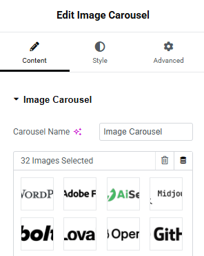
2nd Step: Place the image carousel widget in your new container

You can achieve the smooth image carousel slider effect with the inbuilt widget “Image Carousel” in elementor page builder.
after that add all your images on the media library and add them to this widget.
3rd Step: Most important!
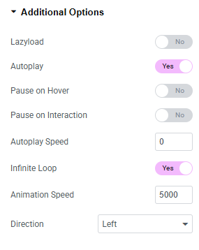
- In the additional options, Enable the Auto play option.
- Disable the pause on hover and pause on interaction options.
- Keep the autoplay speed at 0.
- make infinite loop enabled.
- Keep animation speed at 5000
- and choose the direction to left or right as per your choice.
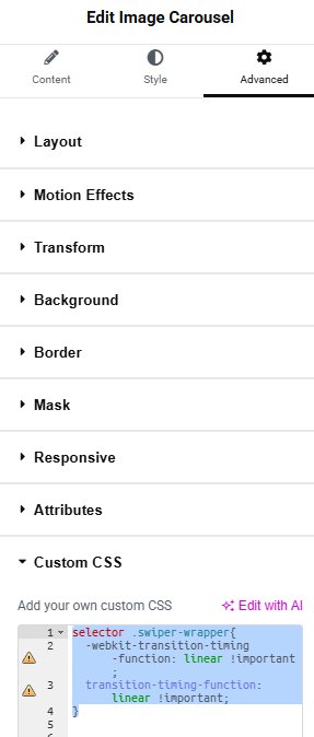
4th Step: Add the custom CSS to the widget in advanced settings
Add the below custom code to the element in the advanced settings in elementor page builder.
selector .swiper-wrapper{
-webkit-transition-timing-function: linear !important;
transition-timing-function: linear !important;
}
And you’re done!
5th Step: Optional – the gradient effect in the beginning and end of the carousel
If you want the smooth sliding effect and smooth gradient effect in the beginning and end of the carousel you can add the below code along with the previous code, to make it look sleek and even more smoother!
selector {
  position: relative;
  overflow: hidden;
}

selector::before,
selector::after {
  content: "";
  position: absolute;
  top: 0;
  width: 80px; /* adjust width of fade */
  height: 100%;
  z-index: 2;
  pointer-events: none;
}

selector::before {
  left: 0;
  background: linear-gradient(to right, white 0%, transparent 100%);
}

selector::after {
  right: 0;
  background: linear-gradient(to left, white 0%, transparent 100%);
}
You can tweak the CSS code as per your choice, to give it the look you want!
Cheers.

Leave a Reply